Product UX · Destination Control · Building Mobility
Schindler PORT: redesigning elevator destination-routing terminals
Schindler PORT is a smart passenger transit system for larger buildings. The redesign made destination selection, keycard-based access and elevator wayfinding clearer across a family of connected terminals.
What this project is about
PORT is not a classic elevator panel. It is a connected destination-control ecosystem that combines touchscreens, keycards, access rights, visitor flows and elevator assignment. Passengers choose or authenticate their destination before entering the cabin, and the system groups similar routes to reduce stops and waiting time.
My work focused on making this intelligence visible at the right moment: the first scan, the first floor choice and the first step toward the assigned elevator.
The challenge
Schindler PORT already had powerful routing logic, but the interface had to explain itself faster. In a lobby, users may be in a rush, holding a phone or coffee, scanning a card, visiting for the first time or moving through the building every day.
The redesign had to improve guidance without making expert flows slower. It also had to scale from compact PORT Mini screens to wider terminals, support up to 60 floors and work with customer-specific branding, access rights and building layouts.
Core challenge
Make a complex destination-control system feel clear in the few seconds people spend at an elevator terminal.
Framing the problem
The previous UI started directly with destination selection. That made manual floor choice visible, but it also made PORT behave visually like a more advanced elevator keypad. The smart part of the system, simply scanning a card and receiving an assignment, was not obvious enough.
The earlier screens also treated many actions with similar visual weight. Keycard scan, manual floor selection, visitor use cases and elevator assignment competed for attention instead of guiding the passenger through one clear next step. The hierarchy made the interface feel functional, but not yet explanatory enough for a busy lobby moment.
This changed how we evaluated the flow: fewer clicks were not automatically better. The stronger solution was the one that made the next action obvious and reduced unnecessary choices for the right user.
We reframed the first screen as the most important decision point: should the system identify me through my card and send me to my regular destination, or should I manually select a public or visitor destination?
Research insights
Speed matters
Observed interactions at OMNITurm were often completed in under 30 seconds, so every screen needed to be direct and easy to parse.
Users arrive distracted
People approached the terminal while using phones, carrying objects or moving through a busy lobby. Large touch targets and clear hierarchy mattered.
Guidance is situational
Daily users need speed, while visitors need more support. The interface had to serve both without becoming noisy.
From many flows to one scalable structure
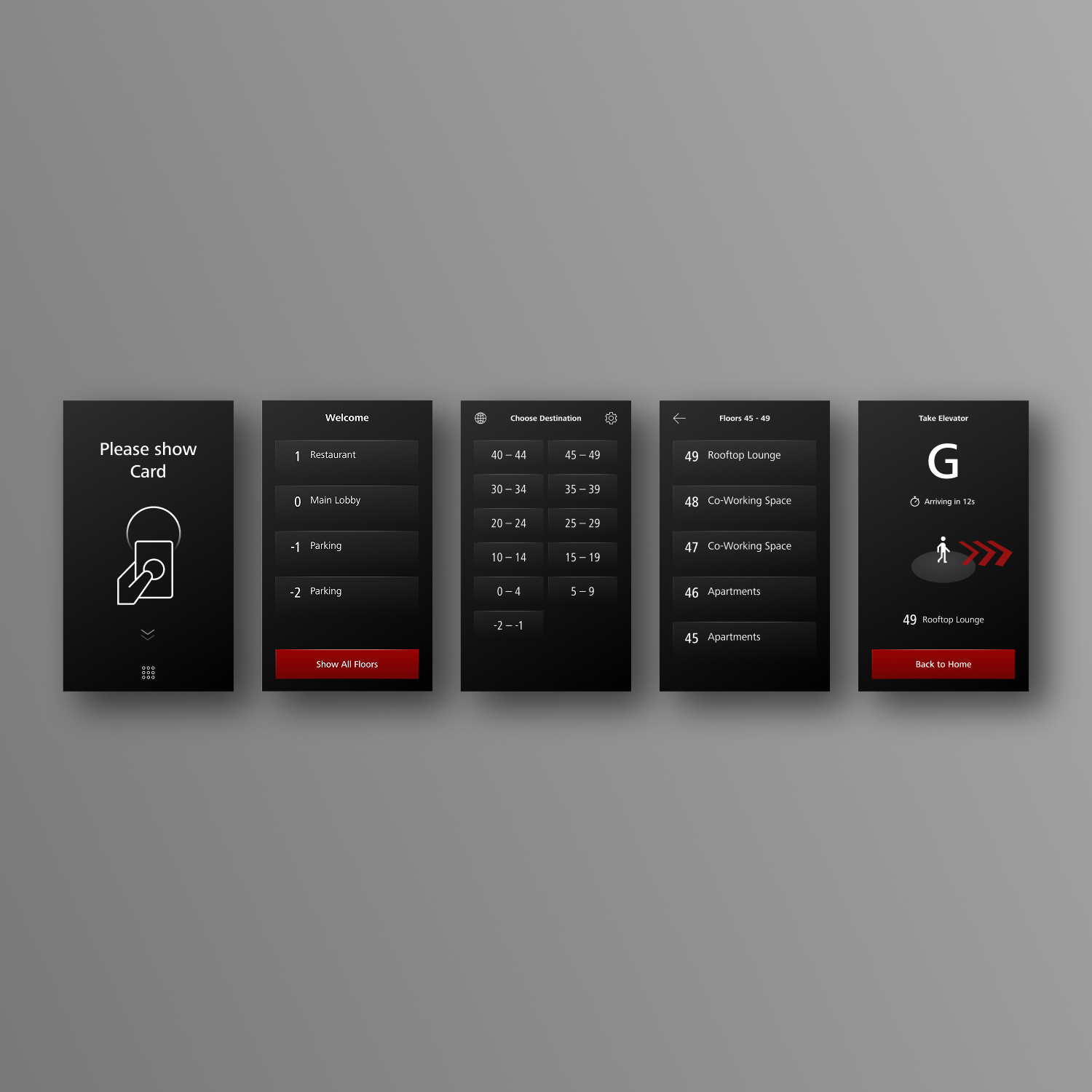
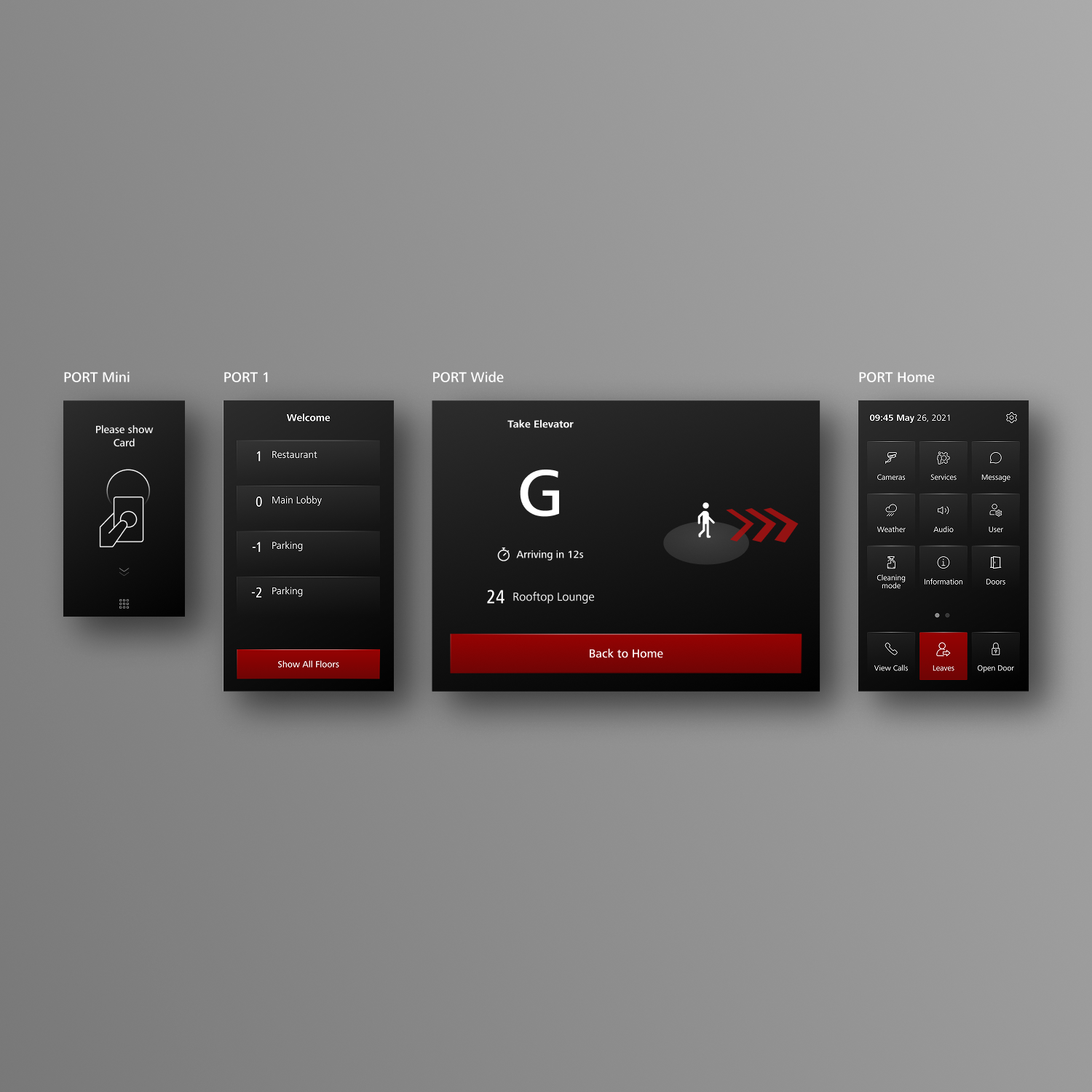
PORT had to support office workers, visitors, residents and people with different access rights. We mapped those journeys across Speed Gates, PORT Visitor, PORT Home, keycards, public floors and restricted floors, then reduced the elevator terminal experience to a clear four-step structure.
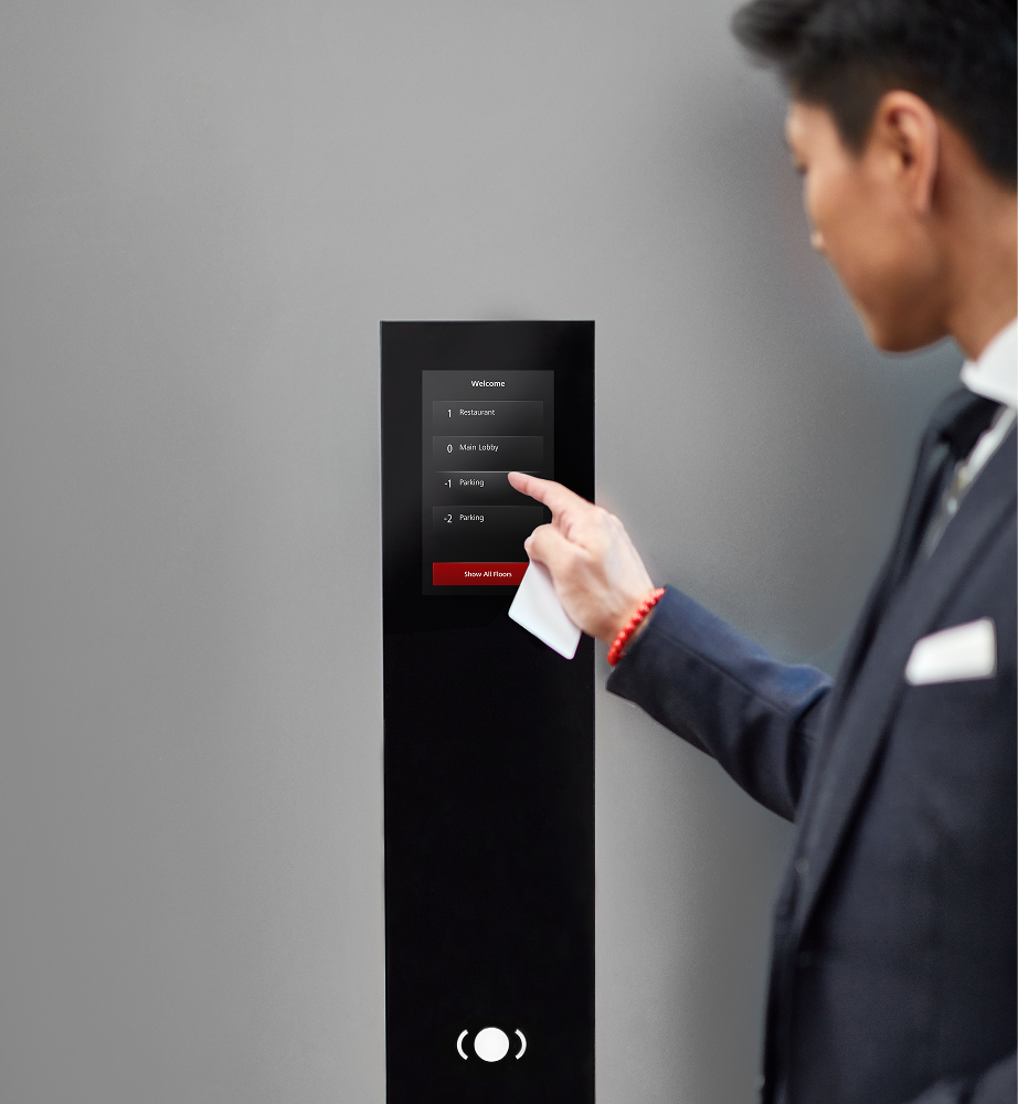
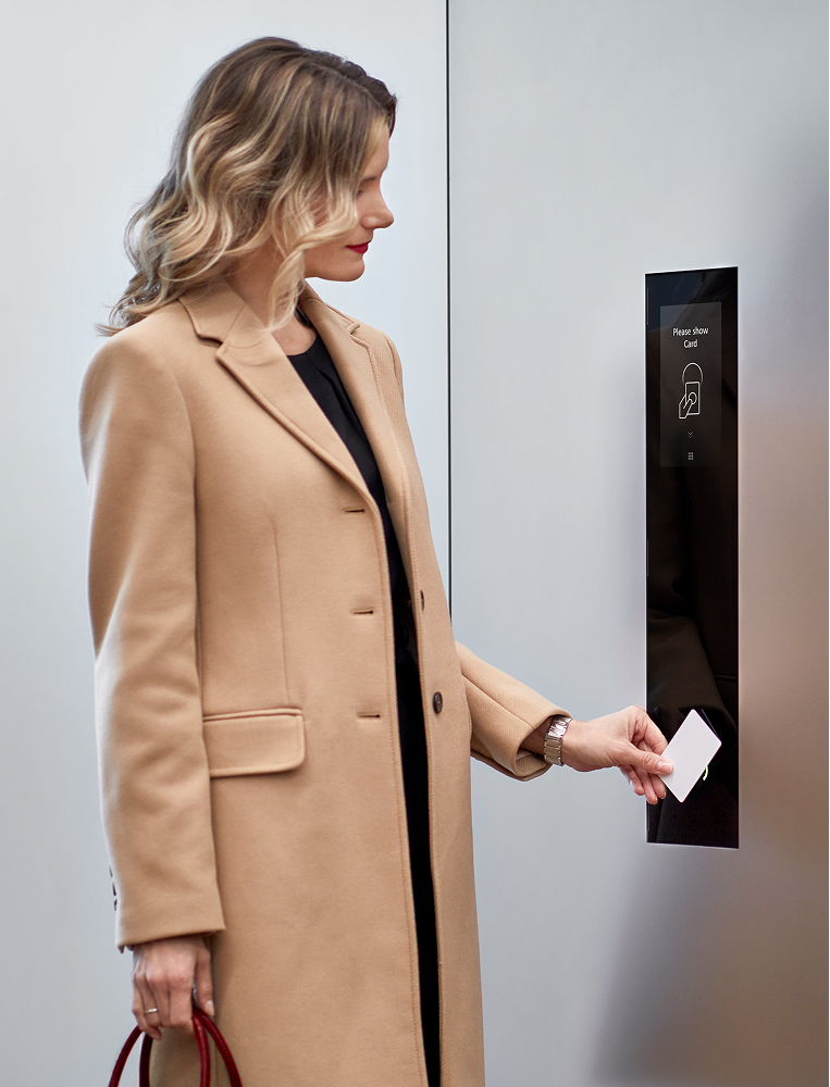
Home screen: scan a keycard, use public shortcuts or continue to all floors.
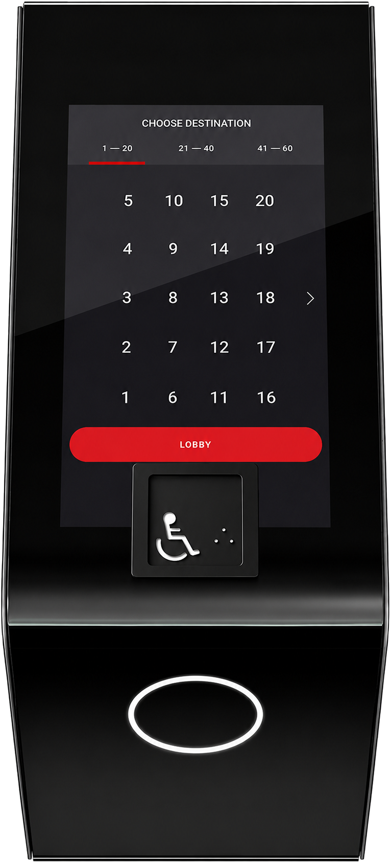
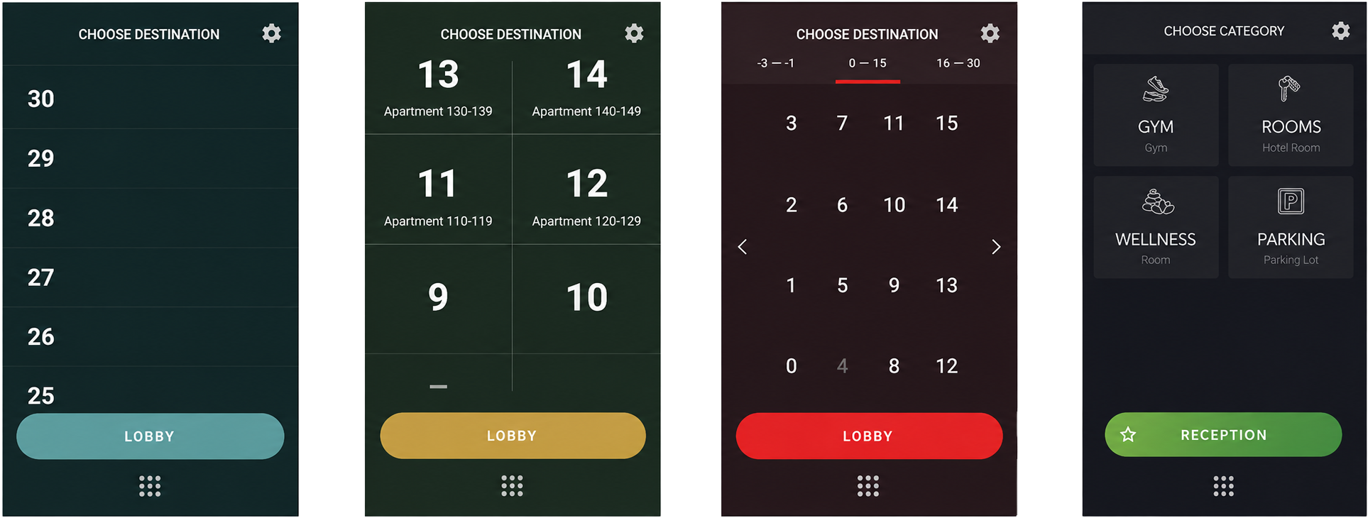
All Floors: group many levels into manageable floor ranges.
Floor Selection: choose the exact destination and recover from wrong choices.
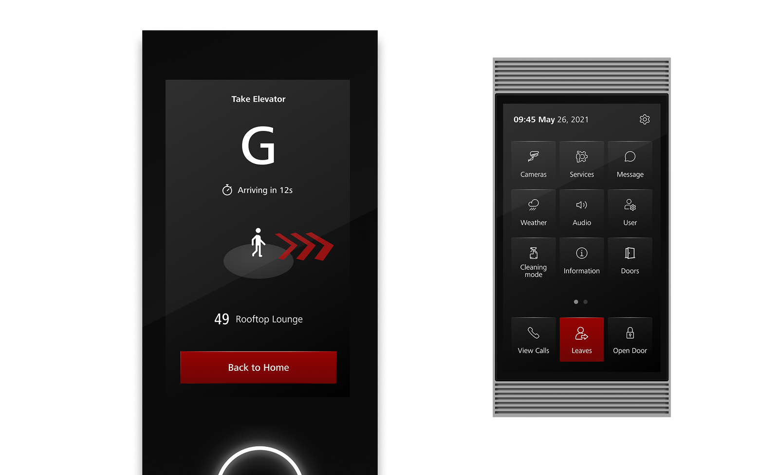
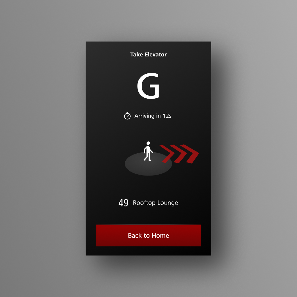
Wayfinding: show the assigned elevator, destination and where to go next.
Product decisions
- Kept the Home screen as the starting point so card-based automatic assignment became visible instead of hidden behind floor selection.
- Avoided long scroll lists because they were inefficient for high floors and did not feel smooth enough on terminal hardware.
- Grouped floors into ranges to make up to 60 destinations manageable on small and large terminals.
- Used large button proportions and stable interaction patterns for fast, repeated public-terminal use.
- Designed locked, restricted and access-denied states because PORT is both a navigation system and an access-control system.
- Developed the automatic destination flow as a user-facing shortcut instead of exposing technical pattern recognition.
Wayfinding and elevator assignment
The assignment screen had to bridge screen and physical space. Users need to understand the elevator label, the destination and the direction to walk. Several wayfinding models were explored, from simple arrows to terminal- or passenger-based spatial references.
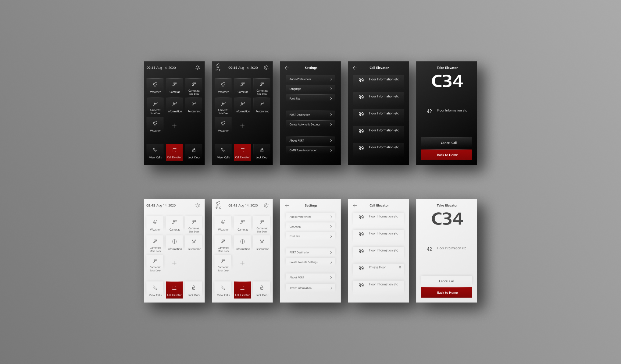
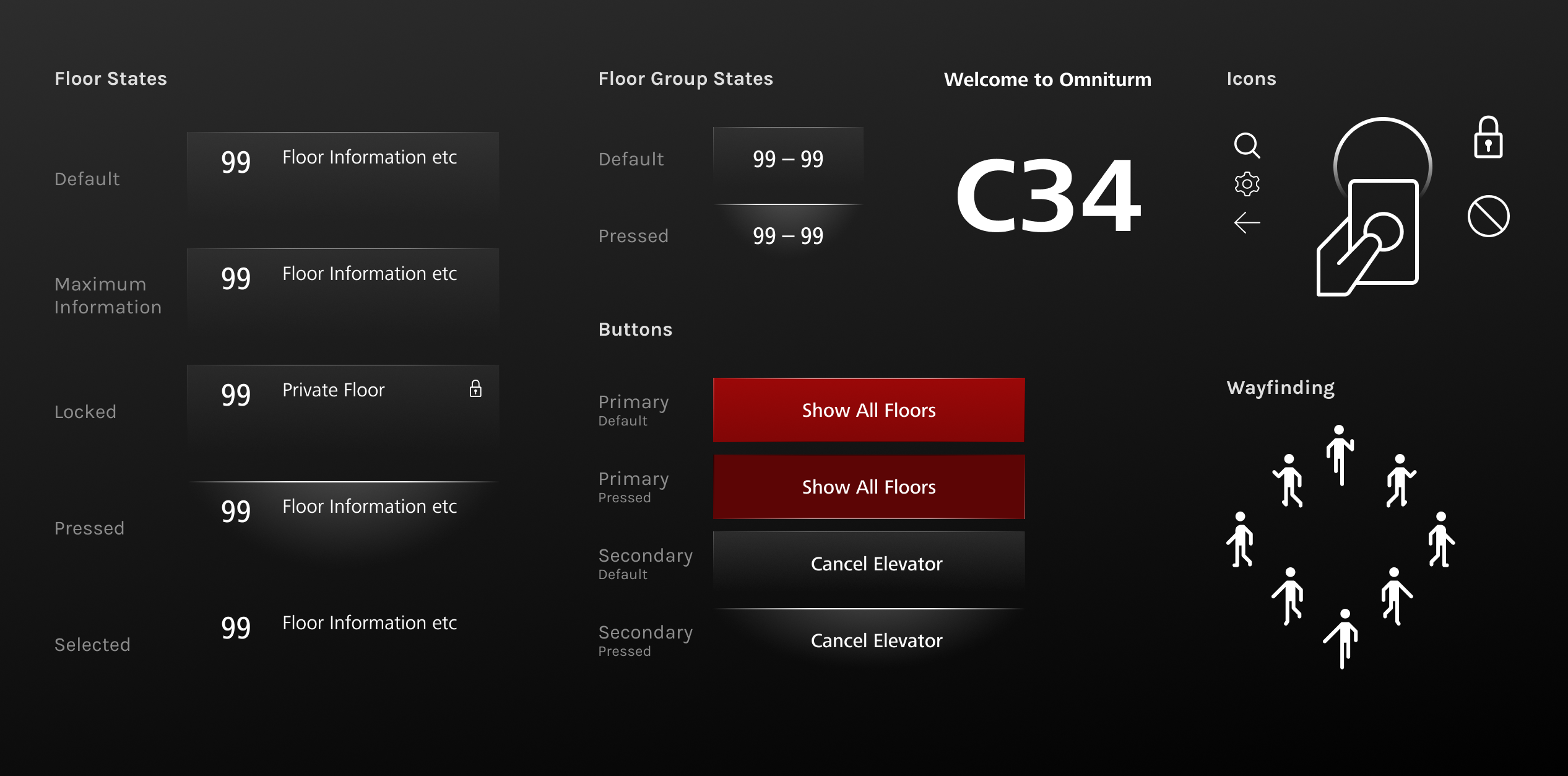
Visual system
The visual design had to feel premium, technical and calm while staying flexible enough for different buildings and customer preferences. Dark mode became the primary direction, with a light mode developed for customers who preferred a brighter interface.
Light edge
A refined light-edge motif gave the interface a spatial, high-end technical character.
Consistent states
Default, pressed, locked, restricted and access-denied states were systematized.
Flexible branding
Accent colors, building identity and customer-specific configurations could be adapted.
Scalable screens
The design worked across PORT 1, PORT Mini, PORT Wide and other terminal formats.
User testing
We tested the concept remotely with 14 participants across three scenarios: going up to a meeting, returning to the lobby and creating an automatic destination after repeated use.
Floor grouping worked
Participants generally understood the All Floors and Floor Selection structure.
Wayfinding needed emphasis
The elevator assignment was understood, but spatial cues and wording had to be clearer at first sight.
Automation needed control
Automatic destinations were attractive, but users wanted to know how to choose a different floor later.
Outcome
The project delivered an implemented UX/UI foundation for Schindler PORT terminals, including final screens, dark and light modes, destination selection logic, access states, automatic destination prompts and wayfinding assets.
The work became part of Schindler's PORT product family and was nominated for the UX Design Awards in 2022.
View UX Design Awards pageWhat this project says about how I work
I work across the full process
I contributed to research, flow logic, prototyping, testing, visual design and final screen production.
I make complexity usable
The project turned access rights, keycards, floor groups and elevator assignment into a clear passenger flow.
I care about product detail
Consistency, micro-interactions, button proportions, contrast and visual hierarchy were central to the final experience.
Interested in the process behind this project?
I'm happy to share more details about the onsite research, concept explorations, discarded navigation patterns, final screen system and product implementation in an interview.
Get in touch